
Good morning!
This week I spent most of my time manipulating code in both Mathematica and Python, to create numerous graphs for my project. Initially, I wanted to finish the Heat Map Graph that I was working on, but unfortunately it didn’t work with graphing by county, as I initially hoped it would. The problem was that some counties had >10 entries, while other counties had none, so the graph was messy and inaccurate. Instead, I created two distinct heat maps: one with a temperature basis, that is focused on hospital density, while the other is based off of Medicare costs. 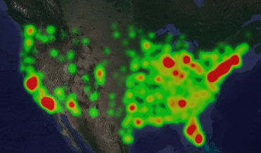
As you can see, this is the graph with hospital density that I created. It is clear that certain areas such as New England, California, and Florida have the highest density, which is probable with population densities. Another thing that can attribute is what I found in the articles I shared in Monday’s post. Since Florida has the greatest percentage of senior citizens, they have numerous more individuals on Medicare, which seems to correlate with the red we see in Florida. After seeing this, I was really curious to graph the different costs of medicare per location. I found this to be easiest to code in Python through gmaps, however it wasn’t without a little trial and error. Below are the three graphs that it took for me to find a graph where you could pull the most information:
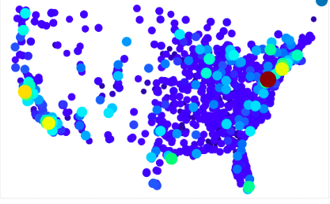
Clearly this graph was WAY too zoomed in to even know what I was looking at.
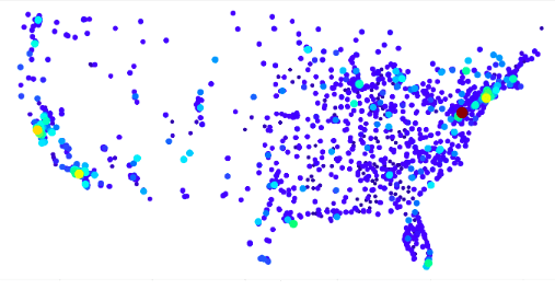
This graph was much better, but I found the dots to be too big and covering one another.
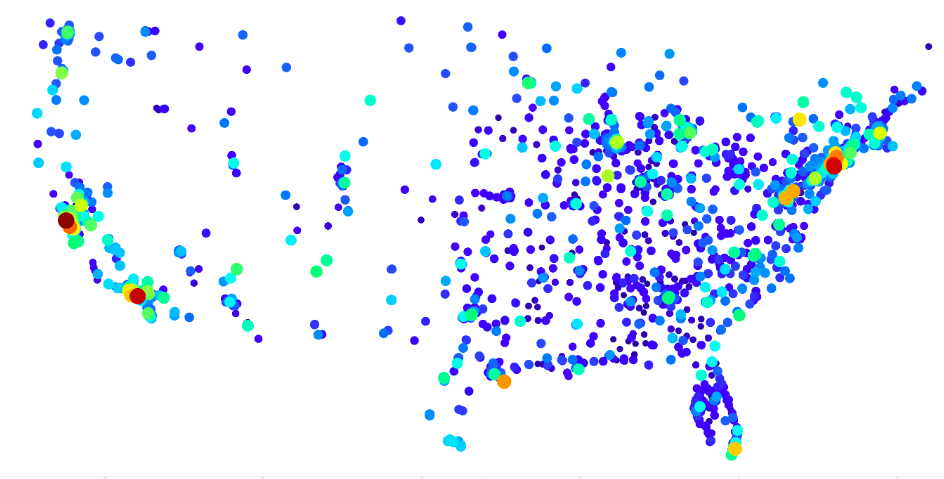
I included two graphs here, with the second one having taken away the largest value, as it was more of an outlier and throwing off the rest of the graph. ($48,000 with the next highest being $34,000).
Although a little harder to see the different colors, I found this graph to be the most practical, as you can clearly see the different dots, especially if you look to California.
I intend to clean this graph up even more, hopefully lay a satellite view of the US behind it, and add a legend, the initial view of it made me curious about a possible correlation between the highest and lowest values. Below are 4 graphs that I made using Mathematica. They plot the location of the lowest and highest 100 and 500 costs for an intracranial hemorrhage using Medicare
Lowest 100 Medicare Costs
Highest100Highest 100 Medicare Costs
Lowest500Lowest 500 Medicare Costs
Highest500Highest 500 Medicare Costs
As you can see, there seems to be some correlation with the lowest costs, as they are all centered around the Southeastern region. Going into next week, I want to analyze that part of the country further, investigating the average income in that area, as well as any other factors that may play into why their costs are averaging so much lower than the rest of the country.