This week has been, needless to say, tedious with my Data Set. For the purpose of my project, I went with 2 distinct data sets; the first being of all hospitals in the United States, and second being hospitals that charged for at least one Intracranial Hemorrhage. The problem was, the second set of data points did not include lat & long coordinates, which are essential when trying to create a heat map.
Needless to say, after much trial and error, and some much appreciated help from Professor Davis, I was able to create a pair of coordinates for each data entry.
With that information, I began working on what I believe, will be the most telling aspect of my project, the Heat Map. As you will see in the graphs below, I didn’t start out too glorious, there are many “error” images I have saved, however with each attempt, I am getting closer to what I want to create.
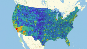
Error1If you look closely (and I mean really SQUINT), you can see that this is in fact the convex polygon of the United States. However, this doesn’t look appealing to the eye, or even allow for any analysis. If you go through my Notebook attached, you can see what I have tried since then, but I think the most promising aspect has been some code I found on the Wolfram Community that plots a heat map by counties in regards to population. Although it takes a while to run, I am hopeful that I can manipulate it into using my data.
This is the population graph that was created based off of population records & Per Capita Income by county throughout the United States.
Now that my data is finally all set to be manipulated, I plan on spending next week taking a look at all of the different ways I can draw an analysis on this data. This will also help with the writing portion of the project, as I begin looking at other studies that have been done on the disparities between medical costs.
March 27 Update
