Final Report Draft (Only the Abstract to go)
Update on Final Report
4.10 Update (A Further Look into Hospitals that Overcharge for Services)
On Monday I said that this week’s focus would be to look at specific hospitals that are charging over $20,000 through Medicare for an intracranial hemorrhage and note any charging policies or factors that are going into the absurd pricing. However, after looking at just 2 of the highest priced hospitals it was clear that something very wrong was going on. My notes from the hospitals are as follows:
- Of the 50 hospitals with the highest price markups, 49 are for-profit hospitals and 46 are owned by for-profit health systems.
- Johns Hopkins Health Center – Advantage MD (Highest Cost at $48,632.28)
- John Hopkins created a “Medicare Advantage plan that is offered by private companies that contract with the Centers for Medicare and Medicaid Services to provide both Medicare Part A (hospital insurance) and Medicare Part B (medical insurance)”
- 11% of the eligible population is enrolled in a Medicare Advantage plan (national is 34%). Approximately 900,000 Marylanders are eligible for Medicare
- ******”The hospital pursued the suits even though they collected millions of dollars from other patients, in the form of higher rates for hospital services, to cover costs for low-income patients who lacked insurance or enough insurance to cover out-of-pocket expenses”
- San Francisco General Hospital (Second Highest Cost at $34,455.00)
- Out-of-network with all private insurance
- “Emergency room fees are also higher, on average, than ERs nationally, in the state of California, and in the city of San Francisco. In the city, they’ve charged up to five times as much. The fees are set by the San Francisco Boards of Supervisors, which has voted for steady increases, doubling the charge since 2010”
- “Facility fees” – “Nina Dang, a 24 year-old woman treated at the hospital after a bike crash, was billed $11,176 for her emergency room visit. The largest item on her bill was a $24,074.50 emergency room facility fee”
- Billed $9.20 for a single ibuprofen tablet in 2013
The biggest takeaway I found was the idea of facility fees and how they can vary not only by hospital or service, but for the same service from person to person, depending on how much money they need to make up for those individuals who can’t pay for their visit. Even further, hospitals like John Hopkins not only gouge services, but then go after those who weren’t able to pay for these “hidden” fees on their bills.
With all of this information in mind, I believe that I can start writing my overall paper, with adding additional statistical analysis or geo-maping along the way.
4.6 Update (Investigation into the Lowest Cost of Treatment)
Hello!
As discussed in Friday’s post, I found there to be some interest into where the highest and lowest values lied in the United States. Although the highest values seemed to be centered in cities, there was a small cluster of the cheapest 100 services around the southeast (especially LA, AL, MS, and FL). As such, I did some statistical analysis to see the disparities between costs for the lowest price of service, against the national averages, and the highest costs. The table is shown here:
| Lowest Values | Highest Values | Overall Values | |
| Min | $4,139.52 | $19,159.40 | $4,139.52 |
| 1st Quartile | $4,817.21 | $19,984.60 | $6,979.85 |
| Median | $4,967.09 | $21,301.30 | $9,722.56 |
| 3rd Quartile | $5,079.50 | $23,895.30 | $11,688.60 |
| Max | $5,162.02 | $48,632.30 | $48,632.30 |
| Range | $1,022.50 | $29,472.90 | $44,492.78 |
| Standard Deviation | 197.332 | 4102.96 | 4022.79 |
I think one of the most interesting takeaways is how widely dispersed the maximums cost are. There is a nearly $30,000 difference, showing that there must be some high outliers. Going into next week, I definitely want to spend some time investigating those specific hospitals, to see exactly what may be causing those absurd costs. I also excluded the highest value of $48,632.30 in my Heat Map graph, but if I find that the range significantly lowers if I cut off the top 10 highest costs, I may adjust the graph even more.
Although the Highest costs had a strange disparity, the lowest costs are fairly universal around the price of $4k – $5k. Even if I include the lowest 500 costs, all values are still $6,200 and under. In fact, if you look at the median of all data, services are still under $10,000. This shows me that for an Intracranial Hemorrhage, there should be no reason that a service costs more than $15,000 (if it were to follow the same dispersion as the lower 50%). The fact that only the top 100 costs have a range of over triple the overall median, shows that these hospitals are drastically over-charging.
Although I will most definitely focus on the reasoning for the high costs, I do want to reflect on the region the lowest costs seem to be centered around. According to a study done by WalletHub, Louisiana and Alabama rank in the worst 10 Healthcare systems, with Mississippi ranking as the worst in the continental United States. I feel that this may have an impact on the cost of services, because if they don’t have access to the best supplies, facilities, or surgeons, they don’t need to pay or charge for those services. What I found to be interesting about this though, was that I believed population of states would have an effect on the costs, but that doesn’t seem to be the case. Florida, in particular, stood out to me as it is the third most populated state, but has a significant number of the lowest 100 service costs, in addition to having quite a few of the top 500 service costs, although those seem to be centered around major cities (Orlando, Miami, etc.)
This week’s aim is to begin looking at the specific hospitals that charge over $20,000 for their service, and try to find rationality for their charges. From there, I hope to begin on writing the final report, in addition to coming up with solutions to make Medicare more understandable and universal.
4.3.20 Update (Graphs, Graphs, and more Graphs
Good morning!
This week I spent most of my time manipulating code in both Mathematica and Python, to create numerous graphs for my project. Initially, I wanted to finish the Heat Map Graph that I was working on, but unfortunately it didn’t work with graphing by county, as I initially hoped it would. The problem was that some counties had >10 entries, while other counties had none, so the graph was messy and inaccurate. Instead, I created two distinct heat maps: one with a temperature basis, that is focused on hospital density, while the other is based off of Medicare costs. 
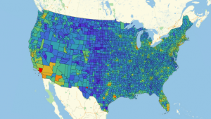
As you can see, this is the graph with hospital density that I created. It is clear that certain areas such as New England, California, and Florida have the highest density, which is probable with population densities. Another thing that can attribute is what I found in the articles I shared in Monday’s post. Since Florida has the greatest percentage of senior citizens, they have numerous more individuals on Medicare, which seems to correlate with the red we see in Florida. After seeing this, I was really curious to graph the different costs of medicare per location. I found this to be easiest to code in Python through gmaps, however it wasn’t without a little trial and error. Below are the three graphs that it took for me to find a graph where you could pull the most information:
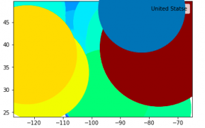
Clearly this graph was WAY too zoomed in to even know what I was looking at.
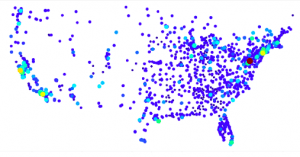
This graph was much better, but I found the dots to be too big and covering one another.
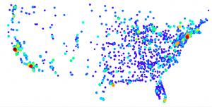
I included two graphs here, with the second one having taken away the largest value, as it was more of an outlier and throwing off the rest of the graph. ($48,000 with the next highest being $34,000).
Although a little harder to see the different colors, I found this graph to be the most practical, as you can clearly see the different dots, especially if you look to California.
I intend to clean this graph up even more, hopefully lay a satellite view of the US behind it, and add a legend, the initial view of it made me curious about a possible correlation between the highest and lowest values. Below are 4 graphs that I made using Mathematica. They plot the location of the lowest and highest 100 and 500 costs for an intracranial hemorrhage using Medicare
Lowest 100 Medicare Costs
Highest100Highest 100 Medicare Costs
Lowest500Lowest 500 Medicare Costs
Highest500Highest 500 Medicare Costs
As you can see, there seems to be some correlation with the lowest costs, as they are all centered around the Southeastern region. Going into next week, I want to analyze that part of the country further, investigating the average income in that area, as well as any other factors that may play into why their costs are averaging so much lower than the rest of the country.
3.30 Update (Outside Research on Medicare)
Good morning!
As an Honors Student, I have to complete an Honors Thesis Project before graduating as a Commonwealth Scholar. Although I had initially planned on completing my project through Undergraduate Research this summer, I am not too sure if those programs will still be running with everything going on. As such, I have decided to take this GeoSpatial Project and form it into my Honors Thesis Proposal. I’m not yet sure if this will be my final project (I’ll have to see how everything with COVID-19 plays out), but for my HON 301 class I am presenting it as my proposal.
Below are three sources that I have reviewed and found helpful in determining the next steps of analysis for my project.
Geographic Variation in Medicare Spending
Cassidy, Amanda. “Geographic Variation in Medicare Spending.” Geographic Variation in Medicare Spending | Health Affairs, 6 Mar. 2014, www.healthaffairs.org/do/10.1377/hpb20140306.633790/full/.
Medicare is the largest single payer in the United States, as it provides nearly 52 million elderly and disabled beneficiaries. It has long been known that there is a large discrepancy of Medicare spending per beneficiary, but this study in particular looks at the direct causes of this disparity. For the purpose of this study, data was collected from the “Five Hospital Regions (HRRs) with the Highest and Lowest Actual Standardized Per Capita Medicare Spending in 2012”. Essentially the data shows how much Medicare pays per person in each region for an entire illness or injury (from initial diagnosis to full recovery). For example, and one of the disparities shown, is for an injury. Although many patients can handle returning home and come in for physical therapy, there are a few who need to be sent to a nursing home, thus increasing the cost of service.
Through conducting the research Cassidy found one thing to be clear, “[there are] inconsistent relationships between health care and quality cost”. Similarly, it was found that these spending patterns and disparities are only seen through Medicare. Researchers looked at health care spending for those with private insurance or Medicaid, but did not see that same variation at the state spending level. One thing the study attributes to this is the level of income states have. They believe that low income states have less money to spend towards their Medicare programs.
Unfortunately the conclusion of the study was that “there is no single answer to addressing variation in Medicare spending by region”. Although they considered many factors, including the same geographic factor I plan to analyze in my study, there were still unexplainable differences. As a result the CMS has decided to continue investigating possible payment reforms, rather than setting a geographic standard of how much Medicare should be paying per region.
State-Level Variation in Medicare Spending
Gage, B, et al. “State-Level Variation in Medicare Spending.” Health Care Financing Review, CENTERS for MEDICARE & MEDICAID SERVICES, 1999, www.ncbi.nlm.nih.gov/pmc/articles/PMC4194651/.
After looking at the initial study and the issues it saw on a state level, I found a study that specifically looked at state spending on Medicare. Although this study was done in 1999, many of the policies and criteria the study was based on are still in effect today. For example, “Medicare provides, in theory, one standard benefit package to all its 39 million enrollees (currently 52 million), regardless of health needs, age, or location”. The purpose of this study was to look at what you are expected to get from Medicare versus what you actually receive, depending on your state.
By looking at national records for patients on Medicare, it was discovered that 35% percent of all beneficiaries live in one of 5 states (California, Florida, New York, Pennsylvania, and Texas), making Medicare an important economic force in these states. Similarly, in more rural states like Iowa and Maine, medicare insures nearly one-fifth of the population. Keeping in mind that some of these individuals may also be eligible for Medicaid can alter the percentage of elderly on Medicare. With this in mind, the study showed that “Medicare payments for those age 85 or over are 44% greater than for the average beneficiary” and the states with the largest number of 85+ residents are Massachusetts and D.C..
Through conducting this study it was seen that although Medicare is designed to be universal and standardized, the use of benefit varies greatly between populations. Everyone may be entitled to the same standard of care, but population density, age disparities, and cost of living by state all play an important role in what percentage of a service is actually covered by Medicare. With this information in mind and applying it to my own study, I can see that it may be essential to compare cost variance with population of those on Medicare, opposed to general population.
The Pricing of U.S. Hospital Services: Chaos Behind a Veil of Secrecy
Reinhardt, Uwe E., et al. “The Pricing Of U.S. Hospital Services: Chaos Behind A Veil Of Secrecy.” Health Affairs, 2006, www.healthaffairs.org/doi/full/10.1377/hlthaff.25.1.57.
With the knowledge obtained in regards to regional discrepancies of Medicare, I thought it would be essential to look into the formulation of how hospitals set their prices. This study takes a look at the widespread practice of “price discrimination” and how the same service can be charged at an array of prices for different patients. The study also covers how prices are updated and how although some hospitals will simply increase all services by a certain percentage, others will only update certain items, or vary percentages for each department.
The study begins by analyzing the objective of price discrimination, stating “sellers seek to maximize the total amount of revenue that can be extracted from society for a given volume of output and, thus their profits”. Hospitals use part of this price discrimination to make up for all allocated costs (primarily pro bono services), so it isn’t necessarily all bad. Along the same lines, private insurance companies are often charged more for an operation, than a patient without any medical insurance because realistically the company can easily pay it, whereas the patient may turn away from the service because they can’t. Now how does all of this affect Medicare?
The study looks specifically into how Medicare approaches price discrimination, because essentially, Medicare pays hospitals flat fees, according to each distinct diagnosis-related group (DRG). However, that DRG fee is then “further adjusted for regional variations in the cost of labor and of other hospital inputs, and for other local factors that might affect a hospital’s cost of producing care”. If you think that statement is vague, it’s because it is. Essentially, Medicare outputs a list to their patients of how much is covered per service. However, that amount ends up varying greatly at the hospital’s discretion based on factors that they don’t necessarily have to defend to the public. Whether an extra surgeon is observing the surgery, they need to use name brand medicine, opposed to generic, or even if a double room isn’t available and you are up-charged for a private room, there are infinite factors that change the cost of service that Medicare doesn’t account for, thus the “Chaos Behind a Veil of Secrecy”.
With these sources in mind, I plan to do spatial data on the 100 highest costs and seeing if there is some correlation. Based off of the articles, I plan on taking state wealth and per capita income in mind, but I think it will be interesting to see if the highest costs are around the rural & most poverty stricken areas that the studies suggest, or if there are some hot spots in major cities with reasons unaccounted for in the articles.
3.27 Update (Data is Finally Clean & Functioning!)
This week has been, needless to say, tedious with my Data Set. For the purpose of my project, I went with 2 distinct data sets; the first being of all hospitals in the United States, and second being hospitals that charged for at least one Intracranial Hemorrhage. The problem was, the second set of data points did not include lat & long coordinates, which are essential when trying to create a heat map.
Needless to say, after much trial and error, and some much appreciated help from Professor Davis, I was able to create a pair of coordinates for each data entry.
With that information, I began working on what I believe, will be the most telling aspect of my project, the Heat Map. As you will see in the graphs below, I didn’t start out too glorious, there are many “error” images I have saved, however with each attempt, I am getting closer to what I want to create.
Error1If you look closely (and I mean really SQUINT), you can see that this is in fact the convex polygon of the United States. However, this doesn’t look appealing to the eye, or even allow for any analysis. If you go through my Notebook attached, you can see what I have tried since then, but I think the most promising aspect has been some code I found on the Wolfram Community that plots a heat map by counties in regards to population. Although it takes a while to run, I am hopeful that I can manipulate it into using my data.
This is the population graph that was created based off of population records & Per Capita Income by county throughout the United States.
Now that my data is finally all set to be manipulated, I plan on spending next week taking a look at all of the different ways I can draw an analysis on this data. This will also help with the writing portion of the project, as I begin looking at other studies that have been done on the disparities between medical costs.
March 27 UpdatePost Spring Break Update (All Work Through 3.22.20)
Update of What Has Been Done:
The last time I updated the class was the Monday before Spring Break, so I will try not to repeat myself too much. That being said, I was having difficulties utilizing Geopy in Python, so over Spring Break I switched over to Mathematica and it was much easier. After taking into consideration looking at the distribution of hospitals across the United States, I found a current complete list of all hospitals (~7,500 entries), whereas the Data I was using in regards to medicare costs, had about 2,700 data points.
Here is my graph of every single Hospital’s Data Point:
graph1Additionally, here is a graph of the population distribution across the United States, according to the last census.
graph2These two graphs looked nearly identical to me, so I didn’t necessarily find the need to use geometric clustering for this. For my next step, I am going to graph the data that I was given with the medicare costs and see if those 2700 points are a good representation of the overall hospitals.
Next Step:
After noticing that the distribution of hospitals closely resembles the general population, I want to start considering the cost distribution and how it relates to geographic position. In order to do this I will first create a heat map of all points, but then I want to utilize geometric clustering for either the top 100 or 500 highest costs of the surgery and the lowest and look to see how those cluster. Are city areas with the highest costs or is it the more rural areas, with only one or two major hospitals in a 100 mile radius.
What I am Having Trouble With:
I’ve never used Mathematica before this project, and although it is fairly straightforward, I feel like I am missing certain things. For example, the second data I have with the medicare costs, doesn’t have lat & long coordinates. I know how to use FindGeoLocation[ ” ” ] to find one coordinate, but I don’t know how to use my file “HosptialAddresses” or “HospitalNames” to find every coordinate.
Here is my current Mathematica Notebook, in case you were unable to view the graphs of distribution across the United States:
Plot


